I love Adaptive Web Design poster design process
In February, Veerle Pieters partnered with Easy Readers and launched the I Love Adaptive Web Design Poster Contest. Since I was lucky enough to be among the winners, I thought it would be a great idea to give some insight on how the poster came together, and what’s the idea behind it.
There is just not enough information online about the complete design process. Sure, there are a lot of tutorials, articles and notes about specific tools or techniques, but design is much more than that, crossing tools and mediums.
Concept
The basic requirement for the contest was to design a poster celebrating your passion for adaptive web design, as stated in the original briefing, so there was plenty of creative freedom.
Veerle Pieters provided the sources for the cover she had designed for Aaron Gustafson’s book, along with the design process for the cover available on her blog, which provided a great starting point for me.
Since adaptive web design is such a broad term, I tried not to use actual devices, screen sizes, or the such, even if those were my initial thoughts. But, even if I didn’t want exact metrics, I still wanted to present the concept in clear way that was easy to understand.
After getting the first chapter of the book, that was available for download, and reading Aaron Gustafson’s clear description of the levels of user experience, the idea of infographics quickly came to mind.
Inspiration
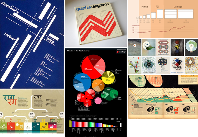
It’s always important to know your history, so, as a designer, it’s mandatory to know where’re we’re coming from. If you’re unfamiliar with design history, I encourage you look into the great work of the past, such as the Bauhaus or the Swiss design style. There are of course many more parts of history to look into, but for a condensed overview with a focus on graphic design I suggest you take a look at DesignIsHistory.
After some browsing around I came up with the following mood board.
The Tower
Afterwards, I started sketching to see if there was anything good I could come up with, starting from the moodboard, the levels of user experience and the general idea of infographics.
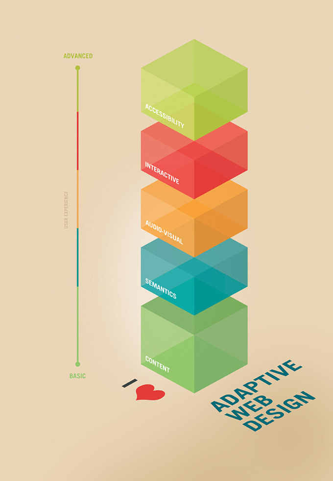
I imagined the levels of experience as skin layers on an onion, but also as building blocks providing a different experience at each height. I prefer a more geometric style, so I decided to work on the “building blocks” idea some more.
After some initial sketching, this is how the first version looked like.
Final version
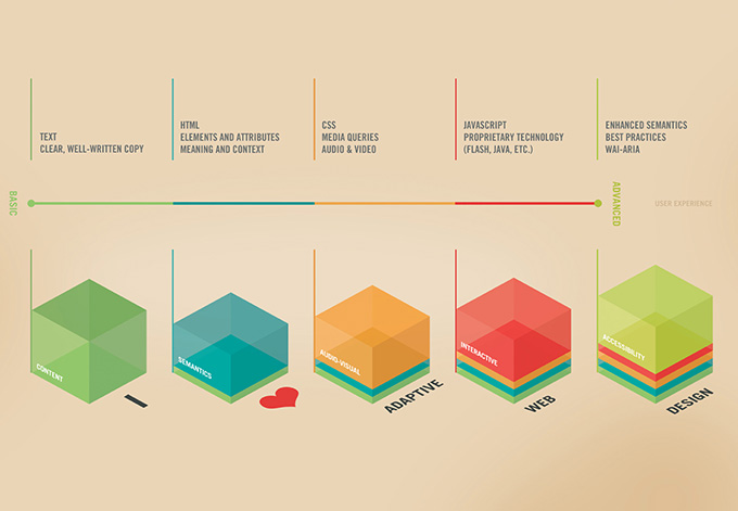
While I was pretty happy with the first version of the poster, it still wasn’t as clear as would’ve liked it to be. The basic idea was to be able to show the poster to somebody who was unfamiliar with the concept, and they could easily understand it.
With this idea in mind, I started sketching and experimenting with including more text, without complicating the overall look of the poster.
Ultimately, the idea came from one of Ladislav Sutnar catalog layouts.
You can find some great articles about design processes on David Airey’s website or on Veerle Pieters’ Blog.
The full list of winners is available on Veerle Pieters’ blog.
Congrats to the winners, the entries were great!
