Lightweight grid system for advanced horizontal and vertical responsive web app layouts, with support for older browsers.
Lightweight grid system for advanced horizontal and vertical responsive web app layouts, with support for older browsers.
If you need to create complex app layouts, similar to native ones, with support for older browsers.
GridLayout is a ~1 KB (minified and gzipped) CSS file and a ~0.5 KB JavaScript file used only for Internet Explorer support.
*If you just support modern browsers, you’re probably better off using Flexbox.
 IE 8+
IE 8+
 iOS 5+
 Android 3+
 Modern browsers
 Opera
Opera  iOS 4
iOS 4
 Android 2.3
Support the overall grid,
but not the scrollview.
Note:
For IE support you must include the gridlayout-ie.js script.
IE8 also requires Respond.js, because the grid is mobile-first.
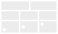 Simple Layout
Simple horizontal and vertical grids, with easy vertical alignment.
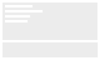 Sticky Footer
Have the footer stay at the bottom, regardless of how much content you have.
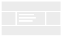 Holy Grail Layout
A simpler solution for the Holy Grail Layout.
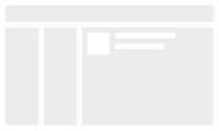 Email App
A three-column email app layout.
GridLayout is built using
display: table,
so you don't have to specify an exact cell size.
If you don't set cell sizes, they will be evenly sized.
<div class="gl">
  <div class="gl-cell">...</div>
  <div class="gl-cell">...</div>
</div>
You can also do vertical layouts, using the gl-vertical class on the grid container.
Vertical layouts will take up the entire height of their container.
<div class="gl gl-vertical">
  <div class="gl-cell">...</div>
  <div class="gl-cell">...</div>
</div>
The breakpoints used in GridLayout are:
By default, the grid will show up on medium (640px or wider) screens.
If you want the grid to show up on any screen size, use the gl-sm class.
<div class="gl gl-sm">
  ...
GridLayout provides a 12-column responsive grid that you can use on both horizontal and vertical grids.
On horizontal grids the size is the width, while on vertical grids the size is the cell height.
The class names contain the media query breakpoint and the size.
gl-sm-1 through gl-sm-12 to size cells on any screen size. If you want the cells to show up small screens, make sure the grid container has the gl-sm class.
gl-md-1 through gl-md-12 for cell sizes on medium screens.
gl-lg-1 through gl-lg-12 for cell sizes on large screens.
<div class="gl">
  <div class="gl-cell gl-md-4 gl-lg-2">...</div>
  <div class="gl-cell gl-md-8 gl-lg-10">...</div>
</div>
You can also manually set a cell size with CSS, and the other cells without a size set will automatically resize.
You can easily nest grids, just make sure you include the gl grid container.
<div class="gl gl-vertical">
  <div class="gl-cell">


    <div class="gl">
      <div class="gl-cell">...</div>
      <div class="gl-cell">...</div>
    </div>

  </div>
  <div class="gl-cell">...</div>
</div>
To make a grid to take up the full height of its container, use the gl-fill class.
<div class="gl">
  <div class="gl-cell">
    <div class="gl gl-fill">
    ...
By default, the cells will expand to fit their contents.
To have fixed cell sizes, and have the content scroll, you can use the scrollview.
Because of cross-browser concerns, the scrollview requires two containers.
<div class="gl">
  <div class="gl-cell">

    <div class="gl-scrollview"
      <div class="gl-scrollview-content">
        ...
      </div>
    </div>

  </div>
</div>
To have a full-height child element in a gl-cell without using a scrollview (eg. as with sticky footers) use the gl-fill class, instead of height: 100%, on the child element.
This helps the IE support script find your element and size it correctly, because IE doesn't pass the correct height to gl-cell children.
Because of Firefox issues with passing height to child elements without having a specific height set on the parent, you also have to use the gl-fill class on the parent gl-cell.
<div class="gl">
  <div class="gl-cell gl-fill">
    <div class="gl-fill">
      Full Cell Height Container
    </div>
  </div>
</div>
You can align content vertically inside cells using the gl-align-middle and gl-align-bottom classes.
<div class="gl">
  <div class="gl-cell gl-align-middle">...</div>
  <div class="gl-cell gl-align-bottom">...</div>
</div>